tryppy
A Mobile Travel App Case Study
UX Design · User Research · Prototyping

Project Specs
Role: UX Designer
Date: May-June 2021
Project Duration: 4 Weeks
Tools Used: Figma, XD, Miro
Team Members: 5
Project Brief
Imagine you've just been hired as a Product Designer for a new travel startup. The startup plans to launch the app once the pandemic ends. The startup's goal is to build a modern-day mobile app that helps people plan their next trip, post-pandemic.
Project Overview
tryppy is a concept for a mobile app, aimed to assist users in helping to plan their next vacation with ease. When a user can't decide on what they'd like to do on their vacation, they can use tryppy's helpful planning feature. By answering a few simple questions, tryppy can curate an itineary specific to the user's wants, needs, or preferences.
The Problem
Travel apps with cluttered design leave the user feeling frustrated and overloaded with information. Trying to sort through all the information makes the actual planning process take up too much time.
The Solution
Create an app that gives people a choice of sorting through information and plan on their own, or they can use the auto-plan feature that generates a custom itinerary curated to their wants and needs.
The Design Process
01- Research
02- Definition & Ideation
03- Prototyping
04- Testing & Iteration


01- Research
User Interviews
My team and I conducted 6 user interviews and distributed a survey to 22 people to understand the user's methods in booking their travel plans.
Some key questions we wanted to answer were: how often did the user go on vacation, how long did they spend researching and planning, and what were some obstacles encountered while planning and booking for their vacation.
Of the survey recipients, 62% traveled for personal reasons, 24% traveled for a mix of personal and business, and 9% traveled for just business.

Competitor Analysis
Direct Competitor- Tripadvisor


Feature Analysis
- The user can skip sign in/sign up and browse the app as a guest user.
- Easy sign in/sign up with existing social media accounts.
- User profile is separate from the rest of the navigation.
- Horizontal scroll groups.
- Combination of vector illustrations and photographs for imagery.
- Sticky bottom navigation tab bar.
- Create custom name for upcoming trips.
General Notes
- Clean app design.
- Well organized.
- Clumsy when it comes to searching.
Strengths
- Free to use.
- Sharing and collaboration with friends.
- Write and read reviews within the app.
Weaknesses
- While you can explore the app as a guest user, many of its features are unavailable until an account is created.
Indirect Competitor-AllTrails


Feature Analysis
- CTA (Call to Action) for the user to turn on location services.
- Sticky bottom nav. Second app to use Explore and Plan as navigation items.
- The User has the option of a free account or guest user; free account has many perks.
- Minimal nature-inspired theming throughout.
- Plenty of filters based on type of activity, accessibility, suitability, route type, etc.
General Notes
- Minimal, nature-inspired color palette.
- There is a subscriber option, but not everything is hidden behind a paywall.
- Great filter system.
Strengths
- Free account option with some in-app puchases.
- Filters to see trails that match your wants or needs.
- Custom maps and the ability to toggle between different maps and map layers.
Weaknesses
- Can't launch the app without a cellular or wifi connection (according to user reviews).
- Easiness of trails is subjective and inconsistent.
02- Definition & Ideation
Affinity Diagram


Ideation & Brainstorming


User Flow

03- Prototyping
User Testing Plan
Objective
The objectives for the user testing plan are: to identify any problems users encounter when making their vacation plans, to identify any problems with the user flow and whether the interface is easy to understand and navigate for the average user.
Target Users
Any adults who semi-regularly make travel plans, whether it be for business or recreation.
Tasks & Scenarios
- User successfully navigates to the home screen from the Sign In/Sign Up screen.
- User creates a custom name for their vacation and lists other important information for their planning process.
- User plans their vacation with tryppy's auto-planning tool.

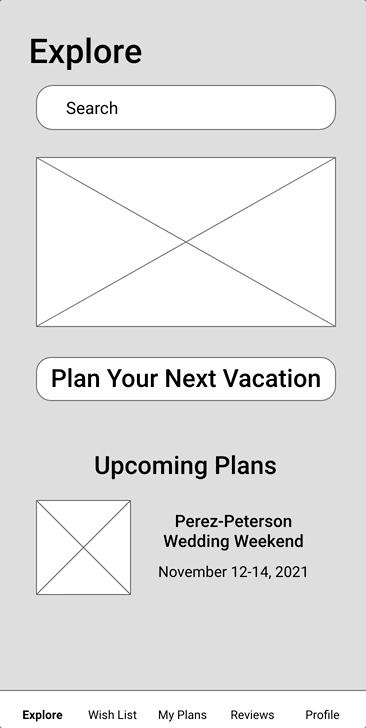
Mid-Fidelity Prototype
Key Learnings From User Tests
Users found the app straightforward and easy to understand. They were able to complete the tasks with little to no prompting. Users liked the auto-plan feature of tryppy, though it was pointed out that some of the questions were too specific and not broad enough.
04- Testing & Iteration
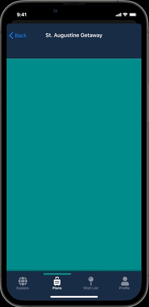
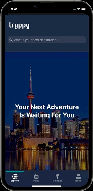
iOS Mockups


iOS Prototype
Based on user feedback from the mid-fidelity prototype, the number of questions in the trip planner was reduced to ten. The questions were changed to be more broad and general when it was commented that they were too specific and wouldn't work with every city. Due to time constraints, this prototype was not as detailed as I would have preferred.
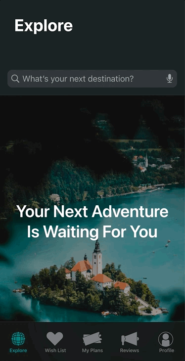
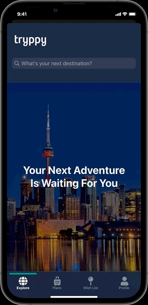
Final Iteration
For the final iteration of my prototype, I went into more detail on my screens, icons were replaced, the navigation menu was pared down from five nav items to four, and more interaction design was implemented throughout.
Final Thought & Conclusion
When users are asked open-ended questions such as "Where do you want to go, what do you want to do?" then most of the time, the answer will be "I don't know." However, when users are given a choice between a limited number of options and are asked for their preference, they'll be able to make a choice.
Users can still choose to search on their own, but tryppy is there to help when the user is beginning to feel frustrated doing it all on their own. And they can always change whatever tryppy plans out for them. The choice, in the end remains with the user.